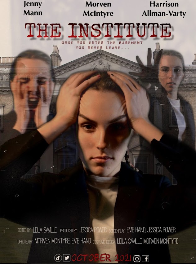
In order to come up with a tagline for our film and have it displayed on our poster, we researched some horror/thriller themed posters to see where we could find inspiration. A compelling tagline needs an emotional hook, which is directly related to the film. Even if it isn't a specific statement, a tagline should stir an emotion that communicates a desire to see the film without explicitly giving away the plot. I am currently drafting my film poster and have considered using these taglines: 'Someone is always watching' 'The walls have eyes' and 'Once you enter the basement, you never leave'


THE WOMAN IN BLACK: A lot that is perceptive and thoughtful here, in particular, in your deconstruction of visual codes that denote horror and the supernatural.
ReplyDeleteTHE CONJURING: You show clear understanding of the ways in which the film's genre is signalled through your discussion of the monochrome colour palette, the mise-en-scene of the empty room with dark walls and the positioning of props such as the rocking chair, together with the sinister gaze of the doll. You understand the function of the references to the director's other work as a way of appealing to audiences. Your observations about the tagline suggesting the film's USP are astute.
ReplyDeleteGRAVITY: Thoughtful appreciation of visual codes such as the position and isolation of the central character; clear grasp of the impact of the font choice of the film title and of the tagline. Institutional conventions such as the billing block, star talent and release date acknowledged.
ReplyDeletePoster: You have conducted thorough genre research and you provide evidence of drafting.
ReplyDeleteYour poster for The Institute is part of a promo pack that convincingly shows a sophisticated use of different types of media language to engage your target audience. The poster features the film’s protagonist in front of The Institute and represents her as a terrified victim in a trio of balanced layered images, all revealing her as alarmed, fear and under attack, her face etched with shadows. This image also re-appears on your film website, cementing the consistency of the branding and clearly signalling genre. Other effective horror / thriller tropes include the striking choice of angular, visually unstable font that looks half-crazed and which drips blood. The same font appears on your social media favicons and website (although there is some inconsistency in the gallery page). The poster features all genre conventions (title, tagline, star talent, release date, billing block, social media) and is finished to a high standard.